The idea was to use theory aligned with blooms taxonomy to create a tower demonstrating abilities. Those that could answer lower level questions would end up as level 1 and would be classed as digitally illiterate, those that could answer higher level questions would be up to level 7 (depending upon how many levels were created). There was also a thought that someone who is at the top would not necessarily know everything about technology but would be able to cope if presented with a new piece of technology, this led to an idea that those at the top of the tower would be digitally instinctive.
The final screen in the game would include this tower highlighting the users level as well as information about that level, their employability and any further recommendations.
However the idea of using Bloom's Taxonomy didn't totally work, so to really establish the results screen, I needed to go back to the definition of digital literacy, I focussed on what literacy meant "the ability to read and write." I could visualise the following:
Read - Explicit Knowledge - Visual - See
Write - Tacit Knowledge - Kinaesthetic - Do
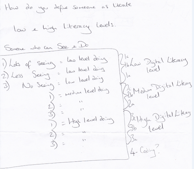
Based on this, I could then see a connection emerging between the seeing and doing. Someone requiring a large amount of tuition or help would be a low level BUT that doesn’t mean that this person cannot do high level tasks. Thus a structure within the High to Low levels was created as shown in the following photo. Someone receiving a high level of tuition to complete a low level task would be level 1c, someone requiring some tuition to do a low level task would be level 1b and those requiring no support to do low level tasks would be 1a. The same structure works throughout level 2 (medium) and 3 (high), the idea of coding seemed to come under a separate level but it dawned on me that coding is a different language. If a native English speaker cannot speak French it doesn't mean that they are illiterate; For this reason coding was left out.


The user would see the tower split into 3 colours Low - Red, Medium - Orange and High - Green, each section would then have 3 mini sections to highlight the letter they are c - lowest and a - highest. The employability and progression advice would still be displayed.
Having decided on the theory to support the game the next step was to work on the structure to help create it.....


No comments:
Post a Comment